

TABBY TEA
Project Overview
- Researched cat cafés, cozy interiors, and playful brand identities.
- Developed soft color palettes, friendly typography, and cat-inspired graphics.
- A café brand that blends comfort, playfulness, and community.
Summary
Tabby Tea is a playful and inviting brand concept centered around creating a cozy, memorable experience for tea lovers and cat enthusiasts alike. The project blends warm, comforting visuals with a lighthearted personality, using soft color palettes, friendly typography, and cat-inspired elements to build a strong and approachable identity
Problem
he challenge behind Tabby Tea was creating a brand that feels playful and themed without coming across as childish or overly gimmicky. Combining two strong concepts cats and tea can easily feel cluttered or unfocused if not handled carefully. I wanted to solve the problem of how to build a clear, cohesive identity that appeals to a broad audience while still maintaining a unique personality
Solution

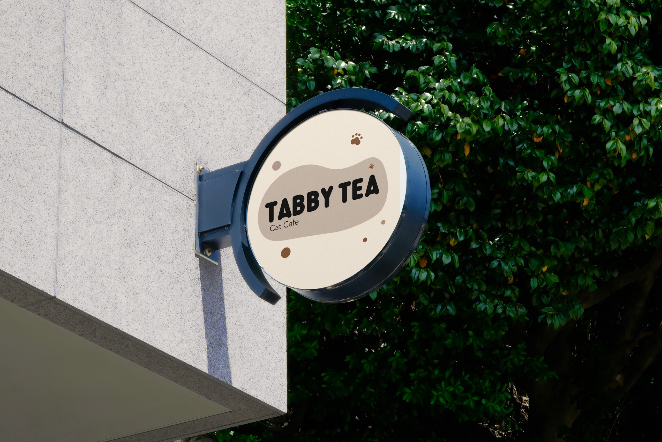
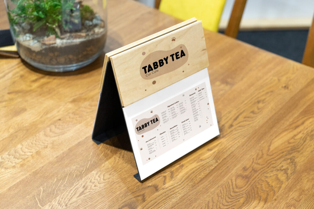
Tabby Tea is a cozy cat café concept designed to create moments of comfort and connection. The branding combines warm visuals with playful elements, making the space feel welcoming and lighthearted while encouraging interaction with cats.