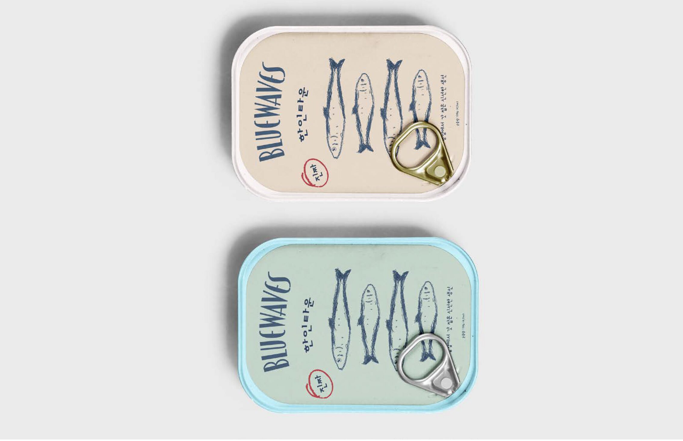
BLUEWAVES
Project Overview
- Studied traditional fishing culture and packaging design
- Hand-drawn illustrations and vintage-inspired layouts
- Packaged sardine brand with cultural storytelling
Summary
Bluewaves Sardine addresses the challenge of reimagining canned seafood packaging in a way that feels modern, appealing, and emotionally engaging. Traditional sardine packaging often leans toward outdated visuals or overly generic branding, making it easy to overlook on the shelf. This project focuses on solving that problem by creating a fresh visual identity that highlights quality, trust, and a connection to the ocean
Problem
The problem behind Bluewaves Sardine was how to refresh the perception of canned sardines, which are often seen as outdated, low value, or visually unappealing. Despite being a nutritious and sustainable food source, sardines are typically packaged in a way that doesn’t reflect their quality or cultural value. This creates a disconnect between the product itself and how it is presented to consumers. The challenge was to redesign the branding and packaging so it feels more modern, trustworthy, and desirable, while still respecting the simplicity and authenticity of the product.
Solution
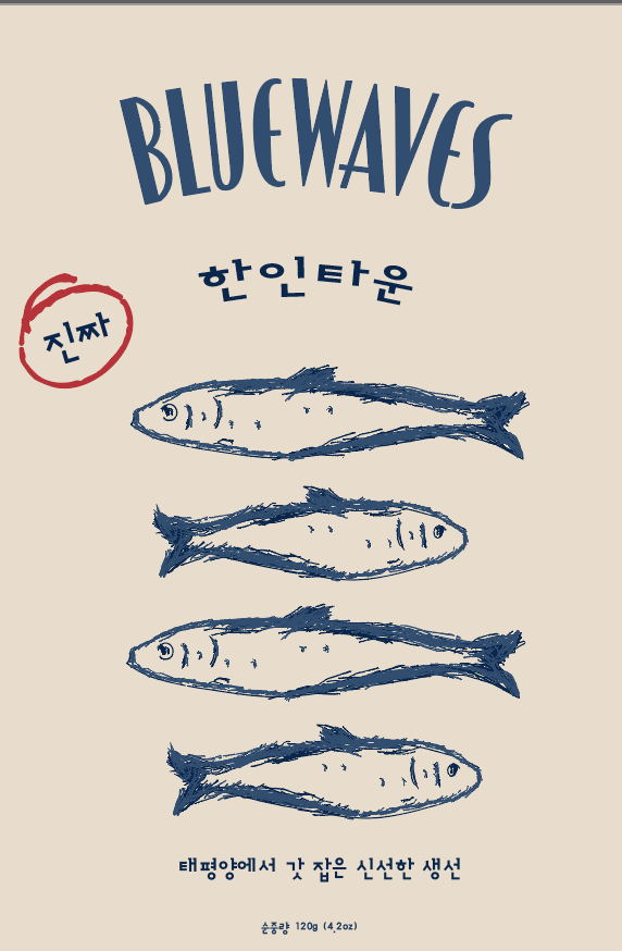
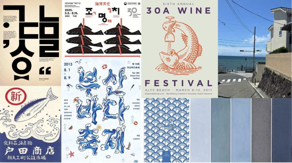
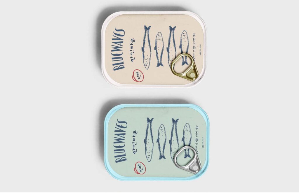
This project is a packaging design inspired by traditional fishing culture. The hand-drawn fish illustrations reflect authenticity and craftsmanship, moving away from overly polished digital design. The result is a brand that feels personal, cultural, and rooted in tradition.